
Make your Google Docs accessible
If you use Google Docs in your online course or share them electronically with your face-to-face students make sure they are readable. Some students use a screen reader to assist them. Here are three tips with the needed steps to make your Google Docs more usable.
Use Alt Text
Most everyone has heard about using alt text when creating web pages. If you include an image in your document you need to add alt, alternative, text. This is what the screen reader will read out loud. If you do not include it the student hears, “image.“
To add alt text to a graphic or image in your document right click on it. The keyboard shortcut to this menu is command+option+Y.
Use headings in your document
Screen readers allow the listener to jump from one heading to another. It is good form for everyone to use the text styles as given. Find them under the Format > Paragraph styles menu–(CTRL+Shift+F) to show–or listed under “Normal text” in the toolbar.
Headings are important in your body text and in any table you use. Google Docs has a limited ability to make tables accessible. However, any table you include should have a header row and, if needed, a header column. Keep your tables short. If you must include a long table, consider prefacing it with an explanation. A listener could hear what the table contains and choose whether or not to hear the contents of the table or jump to the next heading.
Headings let you easily scan a document for things you’re interested in. It also makes it possible for Google Docs to add in a table of contents.
Add a table of contents
If your document is long, add a table of contents. If you are already using proper heading sizes, this is easy.
- From the Insert menu
- Choose Table of contents
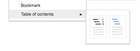
Both options provide links, but the second–without the page numbers–has blue links. Blue text is a great visual queue for many individuals that the text is clickable. Students using a screen reader can jump to heading topics that interest them most. This sounds simple because we are used to visually scanning a document and focusing on what matters most to us. If you have to listen–even at a fast pace–not having headings or a table of contents can make reviewing a document audibly more time consuming than necessary.
These are just three quick tips when planning to share a Google Doc with your students. For more on making your course accessible, look for the upcoming Teaching Tips on Blackboard Ally, and look into Quality Matters at UAF.
Learning how to make your course accessible is an important part of Quality Matters review standards. Standard 8 addresses Accessibility and Usability and speaks to the need to “provide accessible text and images in files, documents, LMS pages, and web pages to meet the needs of diverse learners” (Quality Matters, 2018).
References
Quality Matters. (2018). Higher Education Rubric Standards for Course Design Sixth Edition for Online & Blended Courses [Pamphlet]. Annapolis, MD: MarylandOnline.
Make your document or presentation accessible – Docs Editors Help. (n.d.). Retrieved from support.google.com/docs/answer/6199477


A great tool to help automate accessibility checks on a Google Doc is Grackle Docs. It’s free and integrates right into GSuite. I just used it this morning to make my syllabus accessible and it took about 15 minutes. https://www.grackledocs.com/
Sean, thanks! Always looking for new tools that are easy to use; I’d heard of this one but hadn’t tried it out.